Your cart is currently empty!
Blog
Cardinal Colored Pencil Drawing

Here in kentucky, we are celebrating our first day above freezing since the sub zero winter blast!
Also, I am learning to use colored pencil. After a couple of fails, I was FINALLY able to get the drawing to look the way I wanted it to look! not sure why that had to be so hard?
Hope you all have a great day!
2022 – a year of pottery
oh my gosh! WE MADE A LOT OF POTTERY THIS YEAR!
I think a few got away without getting their picture taken, but here’s most of 2022 squeezed into less than 2 minutes.
Thank you ALL for your support and friendship +making them a part of your home. Especially *you*know*who*you*are -who is responsible more than anyone for this wonderful journey into ceramics.
Watching the year flash by, it was interesting to see the quick flash of time, that was summer at Arrowmont–and then the following months — to see the evolution of a new clay, and new surface design.
Thanks always for making this possible! Yes, the artist is part of the creation of ART–but ART also needs patrons–i believe these pots are OUR team effort!! Thank you all so much!
Looking forward to a wonderful new year!!! Happy New year to you all!!
Lulubelle colored pencil drawing

for the first time in a WHILE i found some time to continue learning to draw with colored pencils. I picked an unconventional color palette, but it worked out…Lulubelle LOVES her portrait!
Faber Castell Polychromos
Pottery At The Pendleton Art Center Dec Final Friday

Well, shoot!!!
After a flock of early birds flew through my studio yesterday, I don’t have nearly as many new pots to choose from. But there are some good ones still on my shelf (including the one i am tempted to keep for myself). I’m very grateful for all the support of my work–this ‘problem’ is every artist’s dream.
Before you make a special trip to our event at the Pendleton Art Center Cincinnati, Here’s a photo of my pottery shelf with it’s current inventory. If you see something you really want, make sure to come to my studio #400 on the 4th floor first. The event starts at 5pm and lasts until 9pm.
Hope to see you tonight!
Kiln Opening 12 December 2022
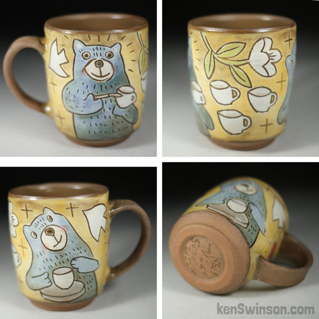
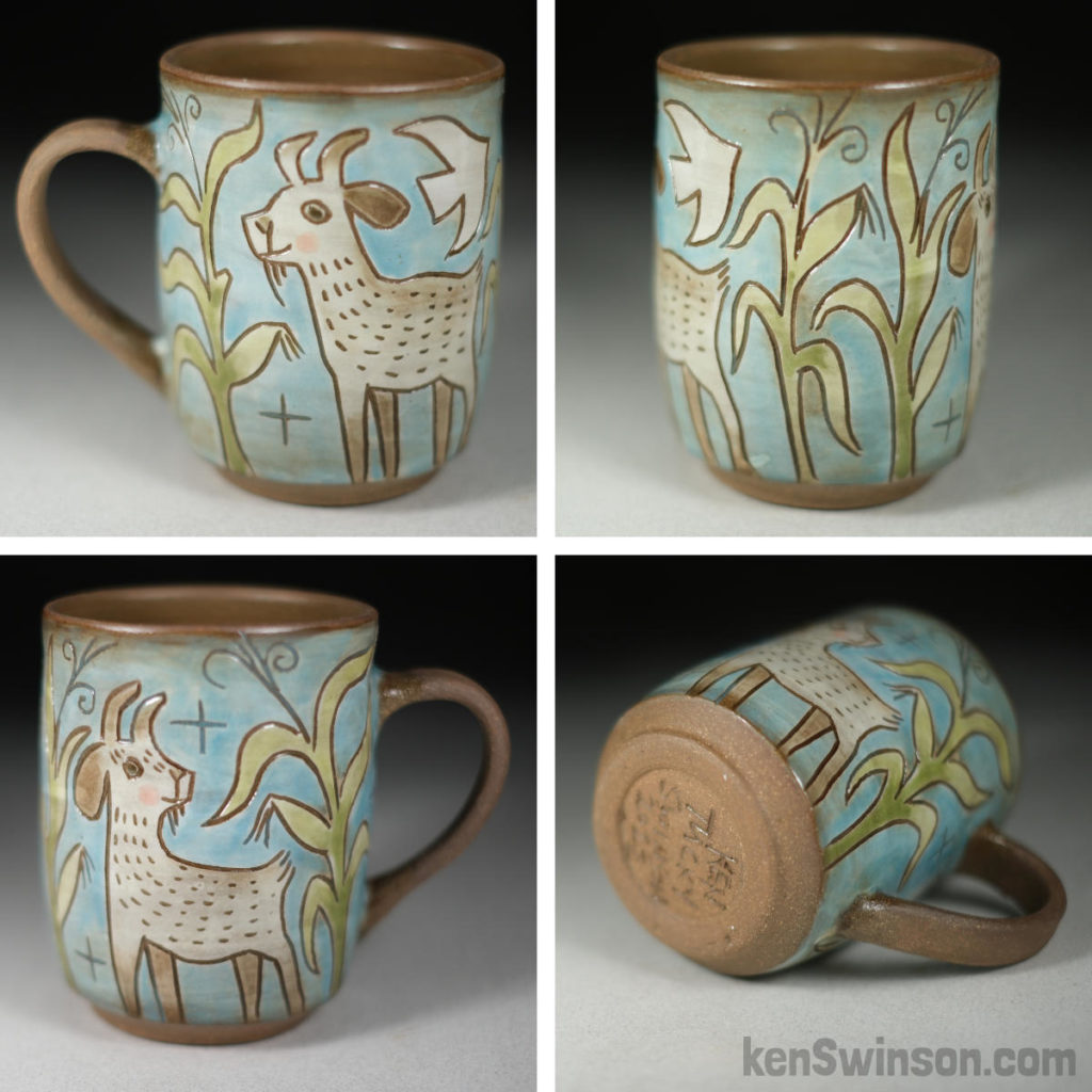
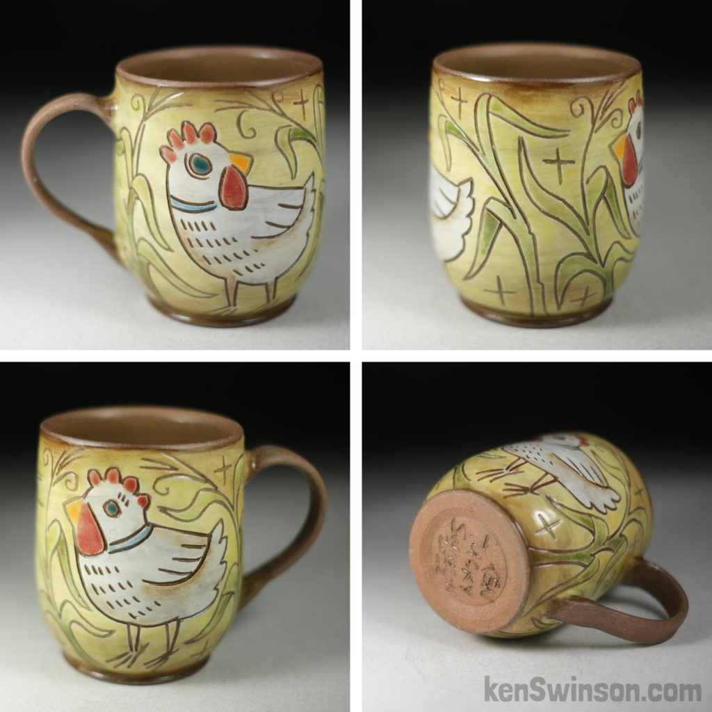
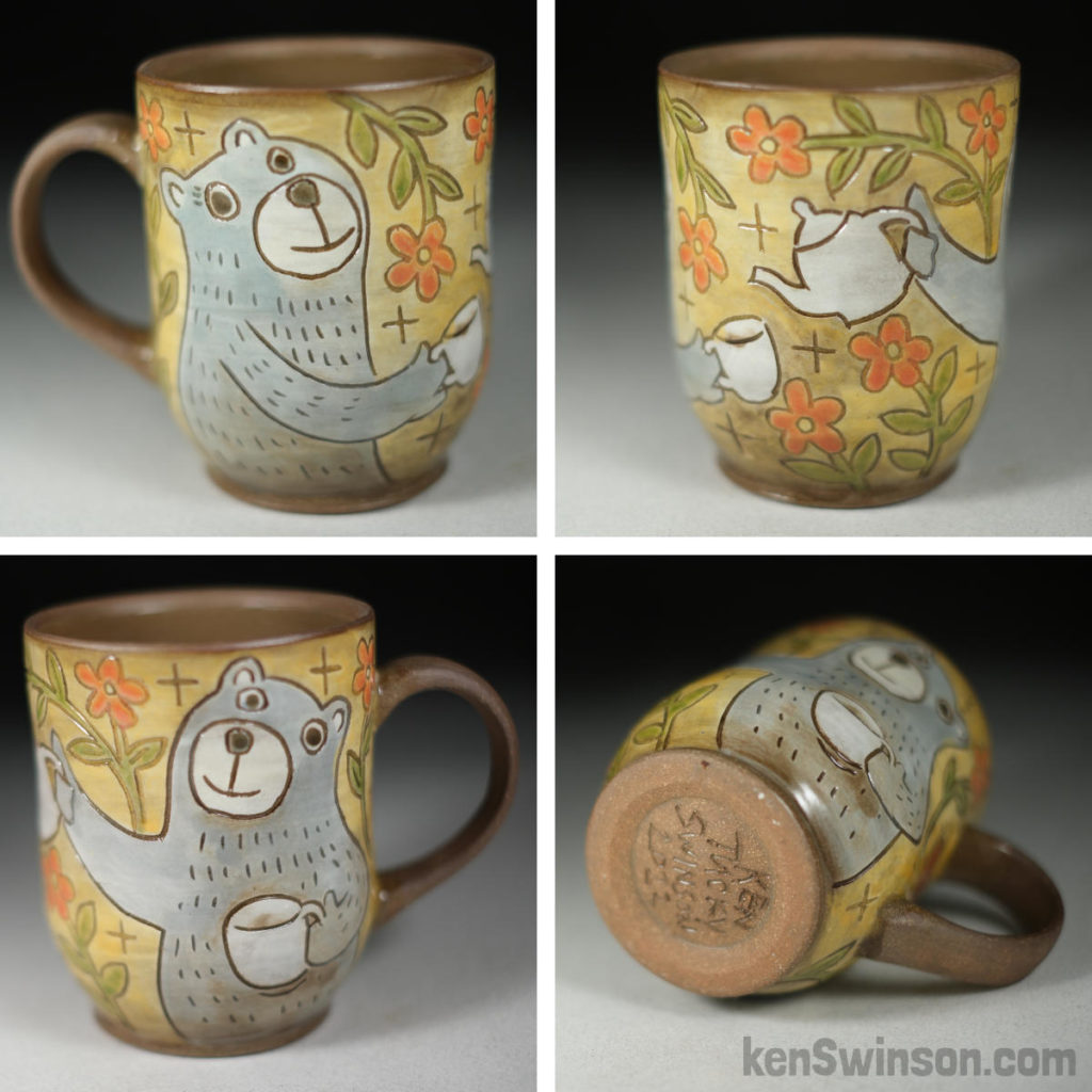
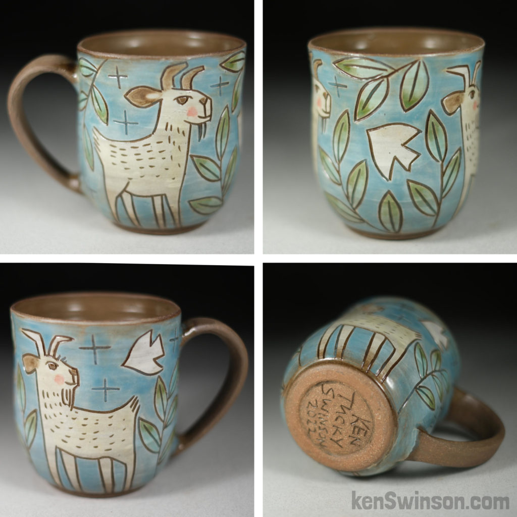
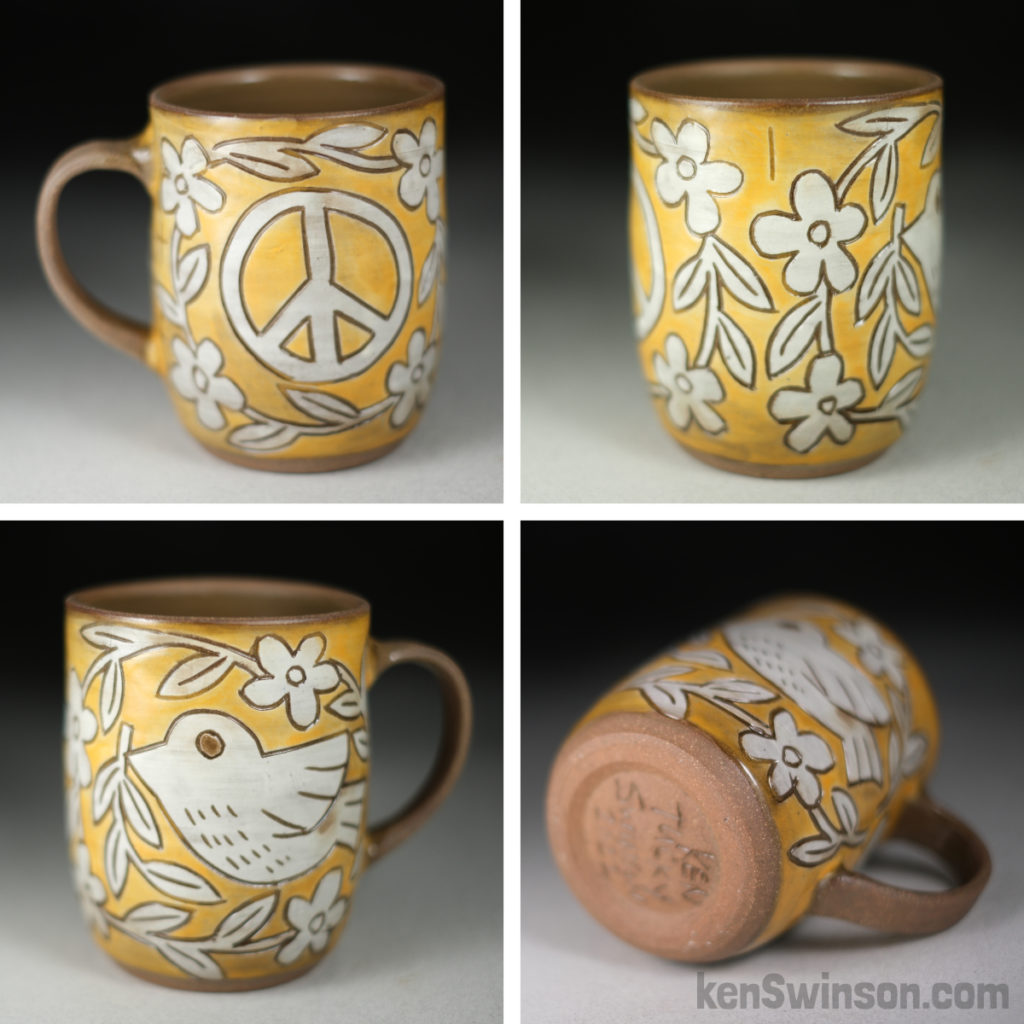
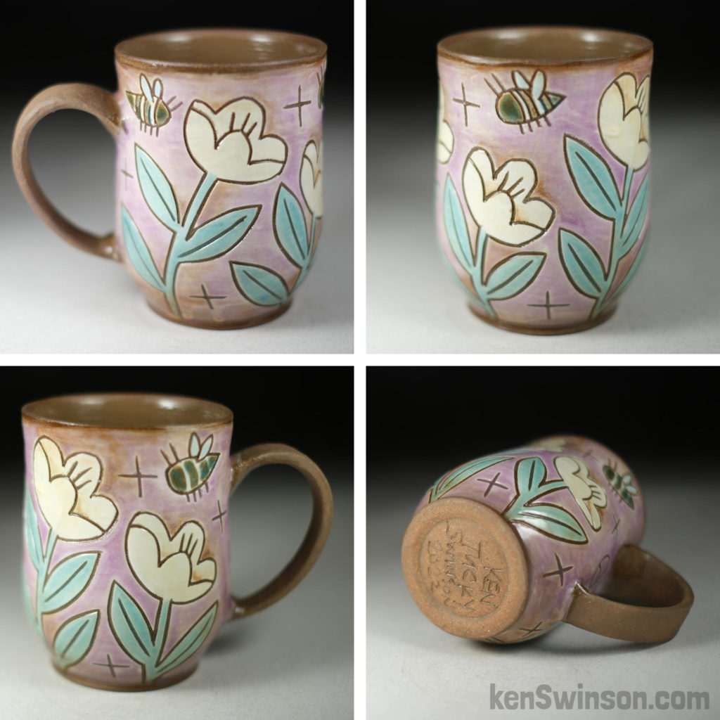
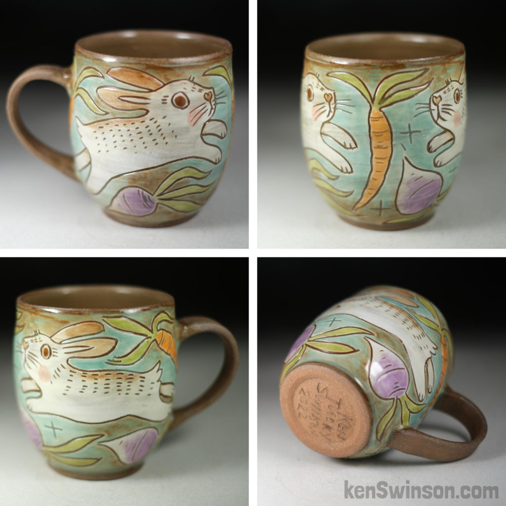
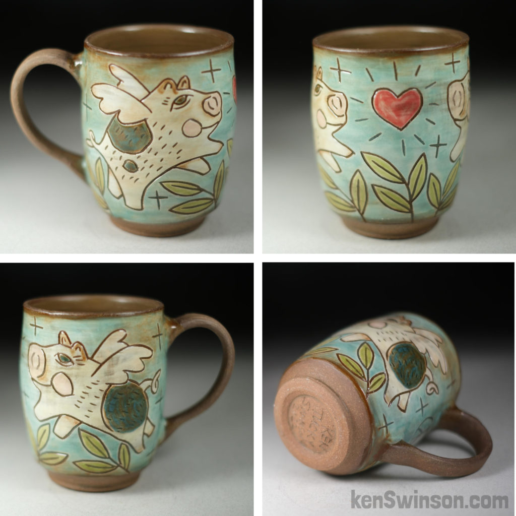
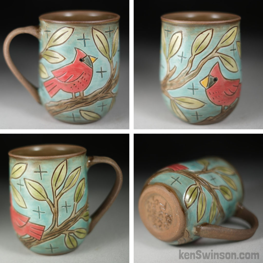
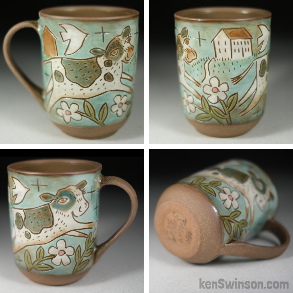
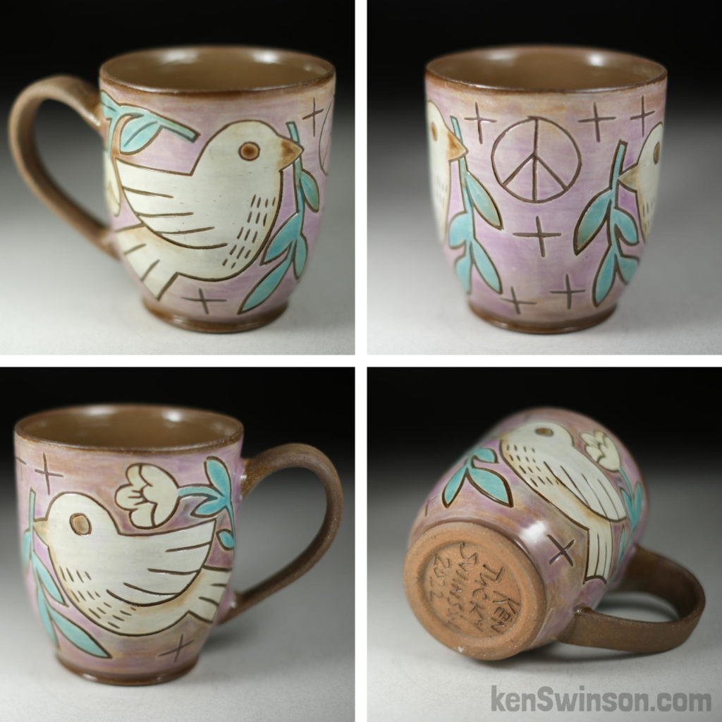
new pottery from my recent kiln opening – swipe or use arrows to see them all
Work In Progress – December 2022 surface design

sorry i haven’t checked in awhile, and am late replying to any messages. I was c aught off guard when I learned that Final Friday at the Pendleton Art Center Cincinnati is going to be Dec 16 (instead of final friday) so I have been working double time trying to make enough cups to have new work to show.
I have a total of 30 finished cups here are the 5 I carved today. Hope to finish carving the last 9 tomorrow, and then it will be a crunch to color them all. Nothing like a deadline to see what is possible! Hope to see you next friday!
i just opened the kiln, and didn’t have any explosions (thats a good thing)!
OmyGosh! I have a BUNCH of cups to paint and fire before final friday (bumped up a week to 16 Decemeber) at the Pendleton Art Center Cincinnati.
perfect grey day to paint cups. The colors will be bright and beautiful after going through the kiln–4 down, only 40 more to go! Work In Progress – making cups in Old Washington


A few carved pots ready for the kiln–after that: COLOR! Stay tuned! 
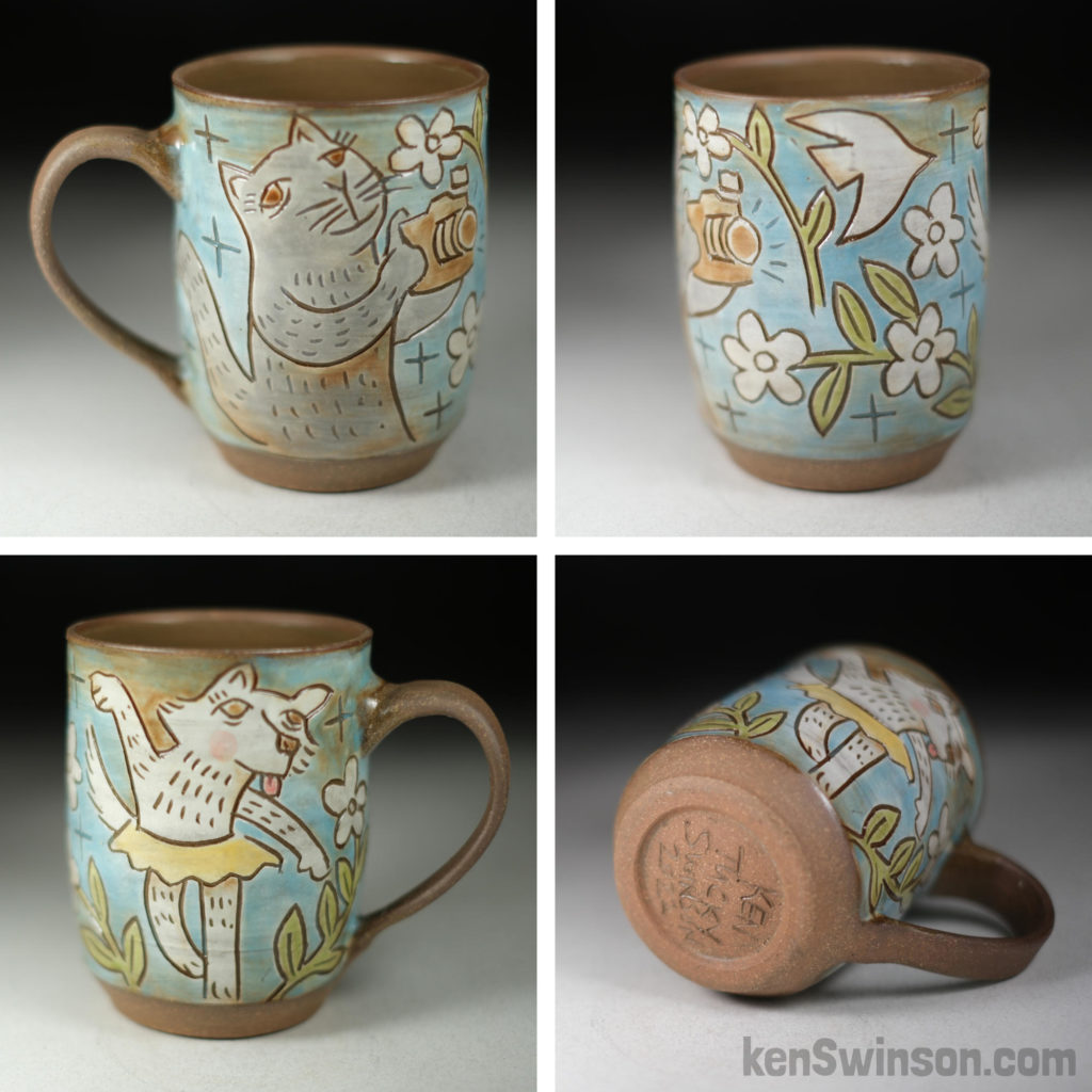
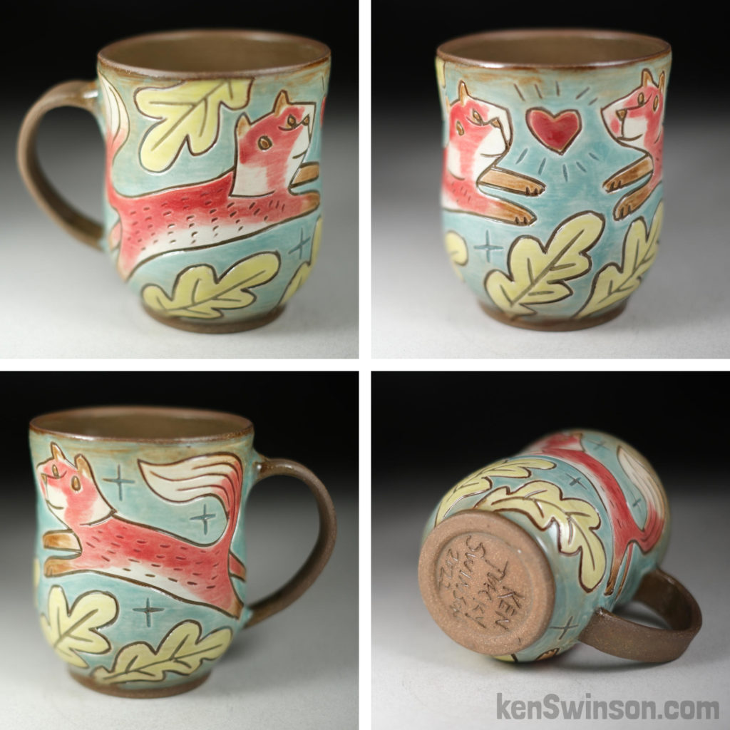
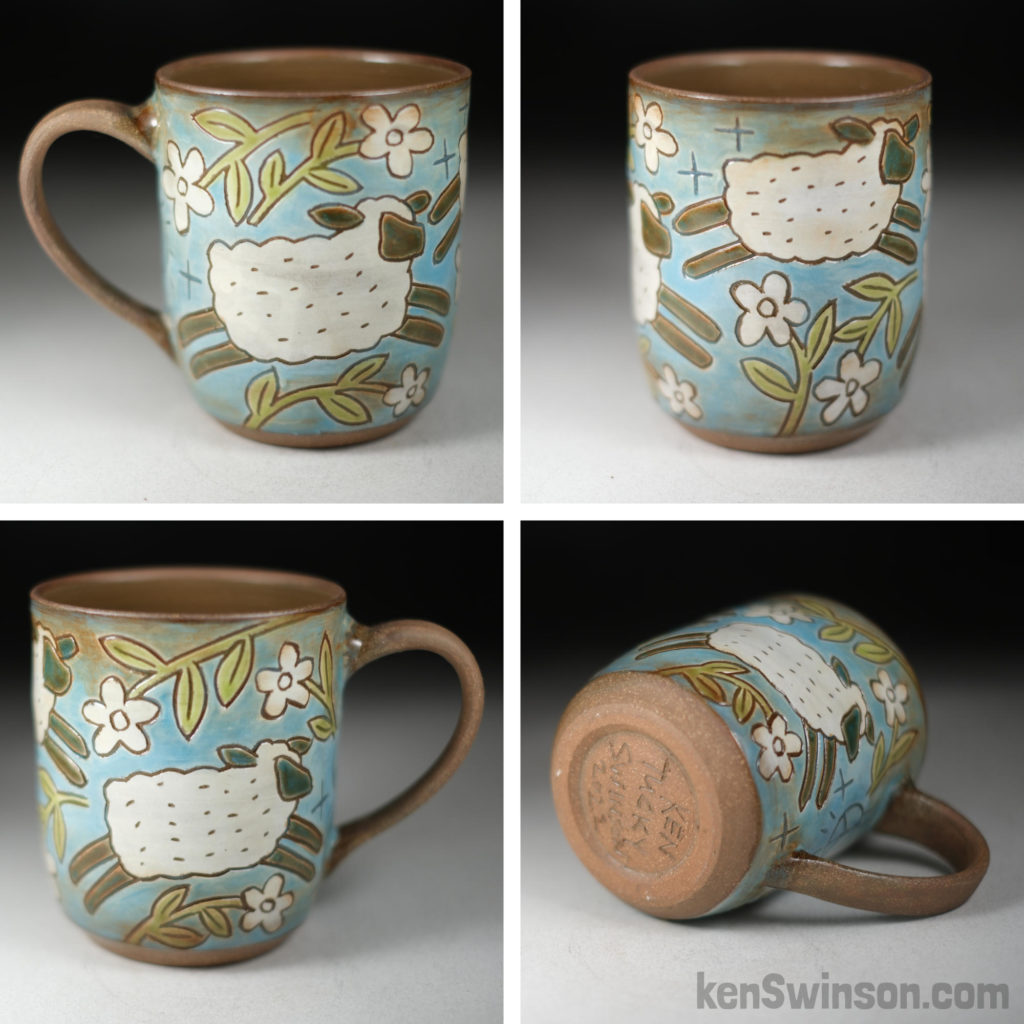
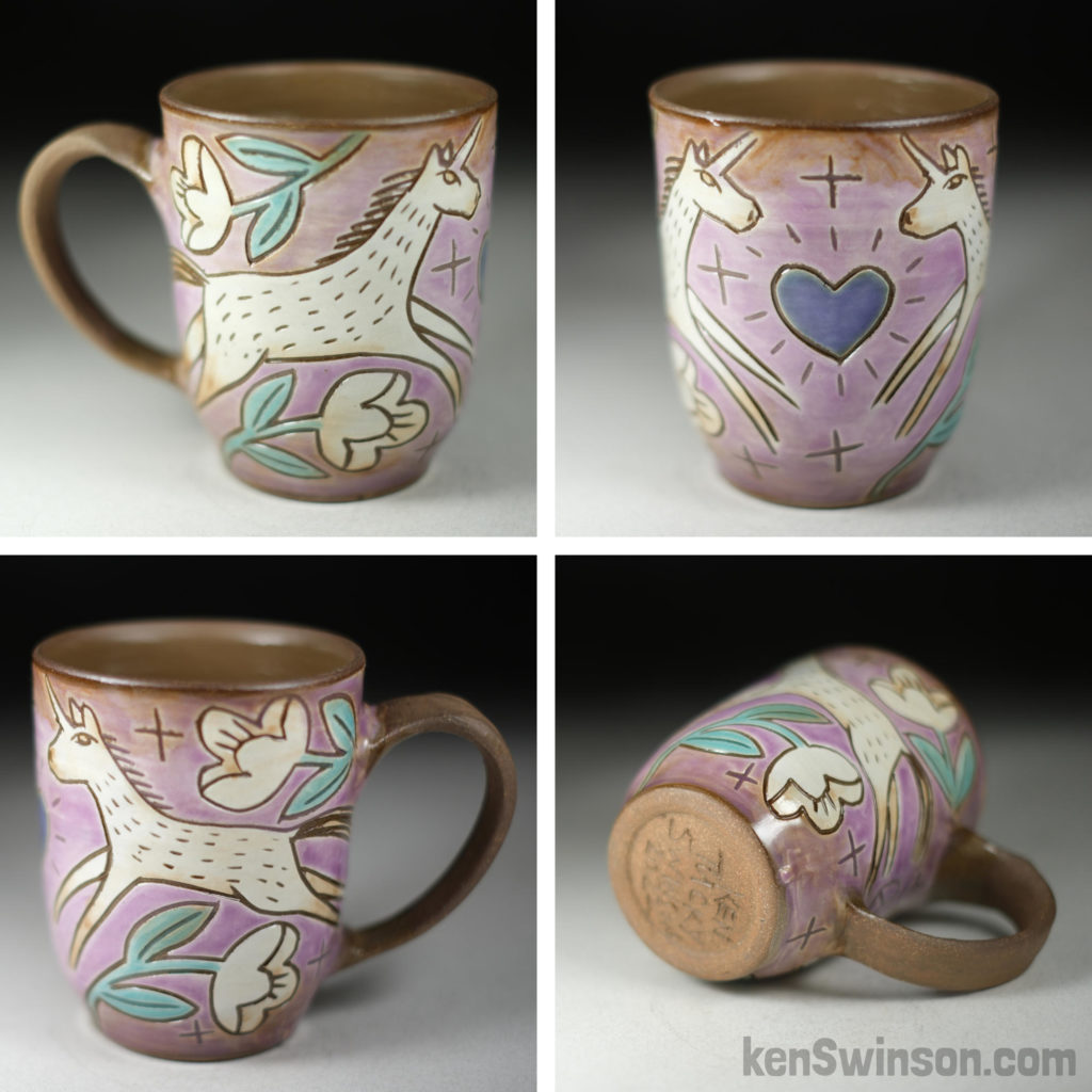
one of the challenges of sharing photos of a 3d object on social media is that the surface design wraps around the cup and a viewer can never see all the artwork at once. It’s been an adventure coming from a 2d background (painting+printmaking) but a fun way to tell a story that unfolds as the viewer picks the cup up and explores the decoration. Pottery on the porch – Frontier Christmas

Didn’t expect to be sign painting this morning:
but we had a storm last night and the wind and water damaged my sign. Fortunately, no pots were harmed!
I’ll have pots on my front porch today as part of 56th Annual Frontier Christmas in old Washington KY from 10-4pm.
Y’ALL!!!!! That was amazing!!!
I sold EVERY SINGLE NEW STONEWARE CUP before noon. Most of the porcelain found its home too. A sincere thank you to my friends and patrons who make it possible for me to live my dream of being a full time artist.
Now that I’m out of pottery. I have to push really hard if I’m going to have anything to offer for my next show on December 16th. Between now and then, if you need me for anything , i’ll be in the clay studio making pots!
Thanks again!Coffee Cup Bear – Colored Pencil
When I’m not in the studio making pottery, I’m trying to learn to draw with colored pencils. Of course, pottery themes keep finding their way into my work. I don’t have a pot problem! lol

Hope you all have a great day!
Drawn with faberCastell Polychromos
- dark Cadmium Yellow 108
- earth Green Yellowish 168
- light Pthalo Green 162
- burnt Ochre 187
- india red 192
- helio Turquoise 155
- pine Green 267
if i was smart–work in progres

if i was smart, I would spend the next week finishing the pottery that I’ve already started 
instead, last night, i threw new pitchers and cups. Today, they need trimming and handles hopeless pot(tery) head!

Spent the day trimming and adding handles, threw a few more cups too. Some white slip on 3 of the 4 pitchers. Will be ready to carve tomorrow. going to try to have these ready by the 16th! 
Spent the day trimming and adding handles, threw a few more cups too. Some white slip on 3 of the 4 pitchers. Will be ready to carve tomorrow.
